


Indian Wallpaper Design Differences Explained
Across global interiors, wallpaper has become a way to introduce character without architectural change. Yet not all traditions approach surface design in the same way. Indian wallpaper design differences are often felt immediately when compared with European and East Asian counterparts, even to viewers who cannot name why. The distinction lies not in ornamentation alone, but in how pattern, scale, symbolism, and visual logic developed in relation to daily life, climate, and social structure.
Understanding these Indian wallpaper design differences helps explain why Indian wallpaper reads differently in contemporary interiors and why it requires careful translation rather than trend-based adaptation.
Pattern as Environment, Not Backdrop
In European wallpaper traditions, particularly from the 17th to 19th centuries, walls functioned as framing devices. French and English wallpapers were developed to complement furniture, paneling, and symmetry. Repeating motifs were often scaled to sit behind objects, reinforcing hierarchy within the room. Even elaborate designs such as toile de Jouy or damask operated within a controlled visual register.
East Asian wall surfaces followed a different logic. In Chinese and Japanese interiors, walls often played a restrained role, with visual emphasis placed on screens, scrolls, and movable elements. Negative space was intentional. Surfaces were designed to support moments of focus rather than sustained visual density.
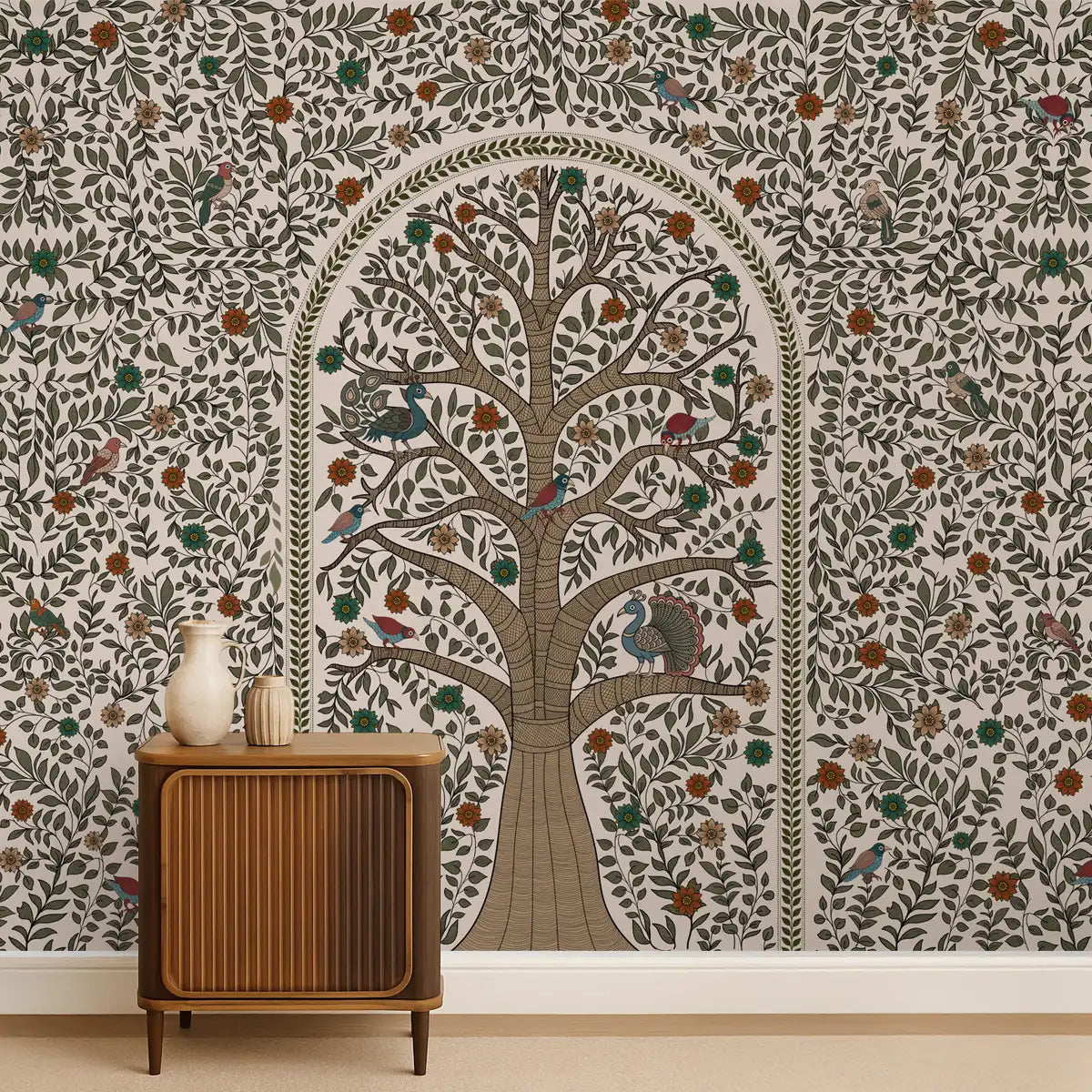
Indian wall traditions developed under different conditions. Walls historically functioned as active visual fields. From temple murals and palace frescoes to domestic plaster painting and textile hangings, surfaces carried meaning continuously across a room. Pattern was not subordinate to furniture or framing. It operated as an environment.
This distinction is central to Indian wallpaper design differences today. Indian patterns tend to sustain visual engagement across large areas without requiring focal pauses. The eye is invited to move rather than settle.
Scale and Repetition Work Differently
European wallpaper often relies on small to medium repeats that preserve balance within enclosed rooms. Scale is carefully managed to avoid overwhelming space. East Asian patterns similarly prioritize moderation, often using asymmetry or sparse repetition.
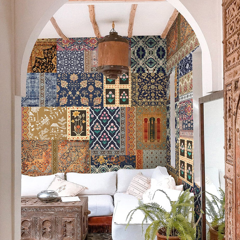
Indian pattern traditions evolved at architectural scales that were often expansive. Courtyards, halls, and temple walls encouraged large-format repetition and layered motifs. Even in domestic settings, painted walls frequently used dense patterning with minimal blank space.
As a result, Indian wallpaper often employs larger repeats or visually complex structures that hold coherence at distance. The repetition is not meant to disappear. It is meant to remain legible across space.
This is why Indian wallpaper design differences are felt even in muted colorways. The distinction lies in structure rather than palette.
Geometry and Organic Form Are Integrated, Not Separated
In many European traditions, geometry and florals are treated as distinct categories. Geometric designs emphasize order, while botanical motifs signal decoration. East Asian design similarly distinguishes between structural pattern and natural imagery, often separating them across different surfaces.
Indian visual systems do not enforce this separation as strictly. Geometry frequently underpins organic forms. Floral motifs are structured through grids, radial symmetry, and proportional systems rooted in mathematics and cosmology. This integration is visible in floor diagrams, textiles, carvings, and wall paintings.
When translated into wallpaper, this results in patterns that feel layered rather than categorized. Geometry supports movement, while organic forms provide variation. The design does not alternate between order and ornament. Both operate simultaneously.
This structural integration is a defining feature of Indian wallpaper design differences, contributing to the sense that the surface feels immersive rather than decorative.

Symbolism Is Embedded, Not Illustrated
European wallpaper historically favored narrative or scenic imagery, particularly during the chinoiserie period and later pastoral styles. East Asian surfaces often reserved narrative for scrolls or panels, keeping walls minimal.
Indian surface design embeds symbolism into pattern rather than depicting scenes. Motifs such as lotuses, vines, interlocking forms, and abstracted natural elements function symbolically without direct storytelling. Meaning is carried through repetition, placement, and proportion.
This allows Indian wallpaper to remain culturally grounded without becoming illustrative. The symbolism does not require explanation to function visually. It operates through rhythm and continuity rather than explicit imagery.
For contemporary interiors, this aspect of Indian wallpaper design differences makes the medium adaptable. It can sit comfortably in modern spaces without demanding contextual knowledge from the viewer.
Color Logic Is Environmental
European wallpaper palettes historically reflected available pigments and interior lighting conditions, often favoring softer tones for enclosed rooms. East Asian interiors frequently limited color use on walls, allowing objects and artworks to carry chromatic emphasis.
Indian color systems evolved in relation to climate and light. Strong sunlight allowed for saturated pigments that retained clarity indoors. Mineral and vegetal dyes produced deep hues that aged visibly over time.
In wallpaper translation, this results in color palettes that retain depth even when muted. Indian wallpaper often uses complex undertones rather than flat color fields.
For modern interiors, particularly in the US, this is another reason Indian wallpaper design differences feel substantial without overpowering neutral furnishings.
Why Indian Wallpaper Design Differences Matter for Contemporary Homes
The distinctiveness of Indian wallpaper is not an aesthetic anomaly. It reflects a different relationship between surface, space, and daily life. When applied thoughtfully, it can bring depth to modern interiors without clashing with contemporary architecture.
Rather than treating Indian wallpaper as a statement piece, it functions best as a spatial anchor. It supports rooms that value atmosphere, texture, and continuity over visual minimalism.
Brahm’s role within this context is interpretive. The goal is not to replicate historical walls, but to translate their logic for present-day living. This includes adjusting scale for apartments, refining color for modern light conditions, and selecting motifs that retain cultural integrity without becoming literal.
Understanding Indian wallpaper design differences allows homeowners and designers to choose it intentionally rather than stylistically, anchoring modern spaces in depth rather than surface effect.
Shop Indian Wallpaper

Nirek Panditha
I was born and raised in Sri Lanka but I come from a half- Indian, half- Sri Lankan background. As I've grown older I've begun to recognise the importance of remembering our collective cultural heritage, be it through the stories, the arts or even craftsmanship that still holds the memory of the hands that shaped it.


Leave a comment
This site is protected by hCaptcha and the hCaptcha Privacy Policy and Terms of Service apply.