


Indian Wallpaper: A Considered Guide for Contemporary Homes
Indian wallpaper tends to arrive in Western interiors with baggage. Assumptions come pre-packed: excess, ornament, colour for colour’s sake, pattern as spectacle. The walls will be loud. The room will feel themed. The design will announce itself before you’ve had time to sit down.
Most of that has less to do with Indian wallpaper itself, and more to do with how it has been misunderstood, diluted, or misapplied outside its original visual logic.
This guide exists to slow things down.
Indian wallpaper, at its best, is not decorative filler. It is spatial thinking translated onto a surface. It comes from a visual culture that never treated walls as neutral, but also never treated them as canvases for chaos. It sits somewhere between architecture, landscape, and drawing. When used well, it doesn’t shout. It settles.
What follows is not a trend report or a buying checklist. It’s a grounded look at what Indian wallpaper actually is, how it developed, how it differs from other wallpaper traditions, and how it can be used thoughtfully in contemporary homes, particularly modern Western interiors, without slipping into pastiche or excess.
Table Of Contents
What We Mean When We Say “Indian Wallpaper”
Indian wallpaper is not a single style and it is not synonymous with “traditional”.
At its core, Indian wallpaper draws from India’s long standing relationship with surface, pattern and environment. Historically, walls in the subcontinent were active participants in daily life. They carried frescoes, lime plaster paintings, geometric divisions, botanical references and narrative scenes. Even when undecorated, walls were shaped, textured, or proportioned with intention.
When wallpaper enters this lineage, it doesn’t replace those traditions, but it carries them forward.
Indian wallpaper often reflects:
Landscapes understood as lived spaces rather than scenic backdrops.
Flora and fauna are treated as rhythm and structure, not mere ornament.
Geometry derived from architecture and planning rather than pure decoration.
Hand drawn or hand-influenced irregularity, even in repeat patterns.
This is why Indian wallpaper rarely feels flat when it is done well. It holds depth, not because it is busy but because it is layered.
A deeper look at how wallpaper evolved in India, from painted walls and textiles to contemporary surface design is explored in A Brief History of Indian Wallpaper: The Legacy on Your Walls. That historical context matters, because without it, wallpaper becomes motif-shopping. With it, it becomes spatial thinking.

Indian Wallpaper and the Question of “Too Much”?
One of the most common hesitations around Indian wallpaper is density. There’s a fear that pattern equals clutter, and that clutter equals visual fatigue.
This misunderstanding stems from scale.
Indian wallpaper is rarely meant to be read at arm’s length. It is meant to be read across a room, across a day, across years. Patterns reveal themselves slowly. Details appear and disappear depending on light, distance and familiarity.
This is especially clear in nature-forward designs. Forests, gardens, animals. Where repetition is less about symmetry and more about rhythm. A forest is seldom uniform, neither are the wallpapers inspired by them.
The idea is explored more fully in Bringing the Outdoors In: Forest Wallpaper and the Indian Imagination, where landscape is treated not as scenery but as atmosphere.

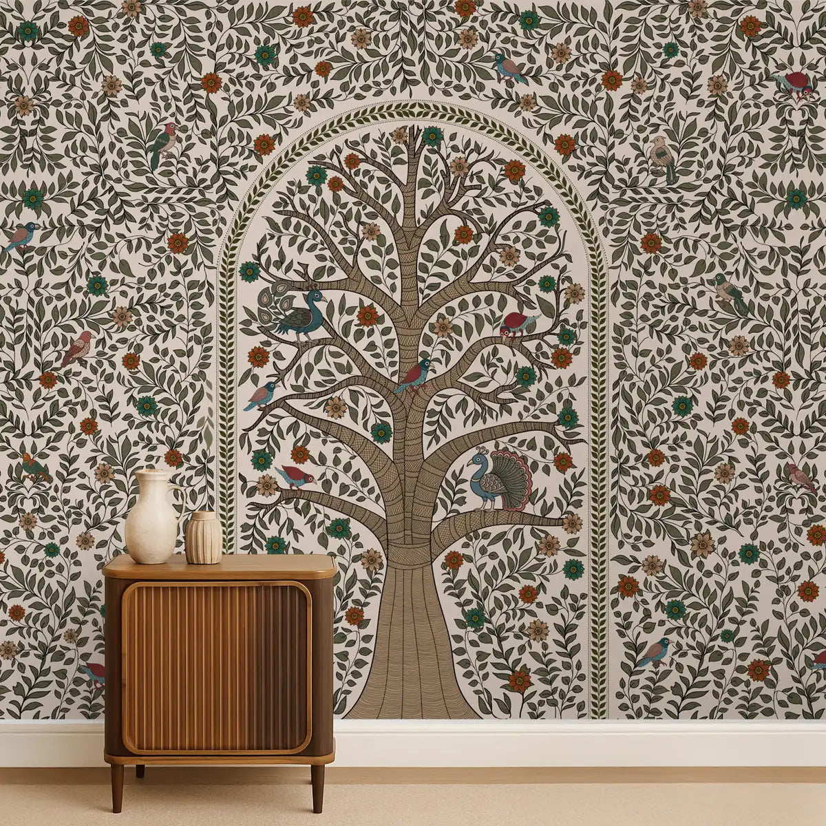
The Role of Nature In Indian Wallpaper
More often than not, you’re bound to see nature in Indian visual culture. It’s not so much a theme as it is a framework.
Forests, gardens, rivers, animals, they are not decorative elements added for charm. Rather they are structural references. They organise space, suggest movement and establish scale. In wallpaper, this translates to designs that can feel expansive, even when applied to just a single wall.
Floral wallpapers, for instance, are rarely about botanical accuracy. Flowers become units of rhythm. Stems guide the eye. Leaves create pauses. The result is a pattern that feels verdant and alive.
This approach to Indian wallpaper is further unpacked in From Gardens to Walls: The Enduring Allure of Floral Wallpaper in India, which traces how gardens influenced surface design long before wallpaper existed as a product.

Animal imagery works similarly with Indian wallpaper. The animals are not mascots, but they are presences, often partially hidden, repeated or abstracted. When used well, animal wallpaper adds energy without novelty. A more nuanced look at this balance appears in The Wild Within: Why Animal Wallpaper Is More Than Decoration.

Geometry, Order, and the Indian Sense of Structure

While nature provides movement, geometry provides grounding.
Indian architecture has long relied on proportion, grids, and modular systems, from stepwells and courtyards to temple plans and urban layouts. These systems were not purely symbolic; they were practical responses to climate, movement, and social life.
Geometric Indian wallpaper inherits this logic. It is rarely ornamental for its own sake. Shapes repeat because repetition creates calm. Lines align because alignment creates stability. Even complex patterns tend to resolve into something legible from a distance.
This makes geometric Indian wallpaper particularly effective in modern homes with clean lines and minimal furniture. It introduces visual interest without undermining architectural clarity.
For a deeper dive into this design language of Indian wallpaper, Sacred Symmetry: The Geometry of Indian Design and Wallpaper explores how geometry functions beyond symbolism.
Abstraction, Imperfection, and the Human Hand
One of the lesser appreciated strengths of Indian wallpaper is its comfort with imperfection.
Unlike industrially precise repeats common in mass-market wallpaper, many Indian wallpaper designs retain traces of the hand. Lines wobble slightly. Forms resist perfect alignment. Colour fields breathe.
This isn’t nostalgia. It’s realism.
Indian painting traditions, particularly miniature and folk forms, never aimed for photographic accuracy. They aimed for expression, balance, and meaning. Wallpaper that draws from these traditions carries that sensibility forward.
Abstract Indian wallpaper often works best in contemporary interiors because it avoids literal reference altogether. It reads as texture, movement, or mood rather than pattern.
This philosophy to Indian wallpaper is explored in The Poetry of Imperfection: Understanding Abstract Wallpaper Through Indian Art.

Traditional, Reimagined, Not Preserved in Amber
There is a difference between tradition and traditionalism.
Indian wallpaper that works today does not attempt to freeze historical styles. It translates them. Motifs are simplified. Colour palettes are edited. The scale is adjusted for modern rooms.
This is not dilution. It’s continuity.
Wallpaper that clings too tightly to historical replication risks becoming a costume. Wallpaper that understands tradition as a source rather than a script feels alive.
That balance is central to Tradition Reimagined: How Traditional Wallpaper Keeps Heritage Alive, which addresses how heritage and Indian wallpaper can evolve without being flattened.

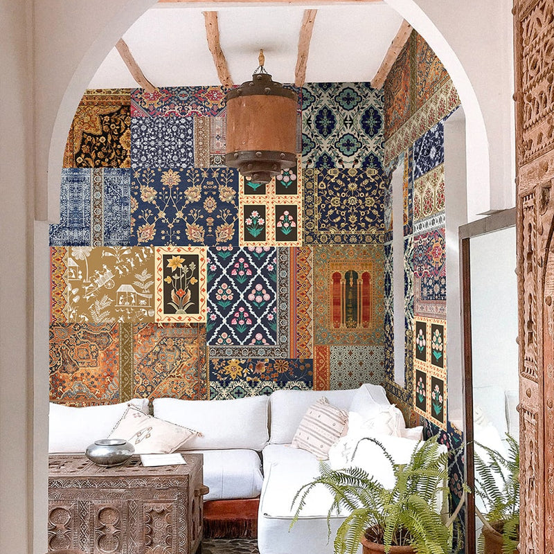
Using Indian Wallpaper in Contemporary Homes
The success of Indian wallpaper has less to do with the design itself and more to do with how it is placed.
In modern homes, restraint matters.
A single wall can do more than four. A hallway can carry more patterns than a living room. A powder room can handle visual density that a bedroom cannot.
Indian wallpaper works best when it is allowed to define a space rather than decorate it. This often means choosing one surface and letting the rest of the room remain quiet.
Furniture matters. Simple silhouettes, natural materials, and honest finishes allow wallpaper to sit comfortably without competition. Overstyling with Indian wallpaper is the fastest way to turn depth into noise.
Small Spaces, Apartments, and the Fear of Commitment
There is a persistent belief that wallpaper, especially Indian wallpaper, requires large rooms. In reality, the opposite is often true.
Small spaces benefit from intention. A corridor, entryway, or compact dining area gains identity when pattern is introduced deliberately. Indian wallpaper, with its sense of continuity, can make a space feel considered rather than cramped.
The key is scale. Large motifs need room to breathe. Dense patterns need balance. Light matters more than square footage.
Apartments, particularly in urban Western contexts, often respond well to Indian wallpaper because it adds character without requiring architectural change.
Materials, Printing, and Why Quality Shows Over Time


With Indian wallpaper, material is not a secondary decision. It is part of the design itself. Because these patterns rely on depth, layering, and subtle variation, the surface they are printed on changes how they are read immediately, and years later.
Unlike graphic or high-contrast wallpapers, Indian designs are rarely about instant impact. They unfold slowly. Ink density, surface texture, and finish all affect how light interacts with the artwork, how details emerge, and how the wallpaper settles into a space. This is why quality shows up over time rather than on day one.
A flat, glossy surface tends to compress Indian artwork. It reflects too much light, flattens tonal variation, and reduces depth to pattern. Matte finishes, by contrast, absorb light unevenly. They allow shadows to sit. They soften transitions. They make the wallpaper feel part of the wall rather than a layer sitting on top of it.
This is why BRAHM offers multiple paper options not as upgrades, but as different ways of living with the same design.
Soft Feel wallpapers have a smooth, matte surface that reads quietly in a room. The absence of sheen allows colours to remain grounded and prevents visual glare, particularly in spaces with strong natural light. This finish works well when the design itself carries complexity and you want the surface to remain understated. Over time, the wallpaper feels less like a printed product and more like a painted wall that happens to carry a pattern.
Premium Textured wallpapers introduce a subtle tactile dimension. The texture is not decorative; it is structural. It catches light differently across the surface, giving depth to forested scenes, layered florals, and abstract designs. This texture reinforces the hand-influenced quality of Indian wallpaper, making imperfections feel intentional rather than accidental. In lived-in spaces, dining rooms, living areas, corridors this texture often becomes more compelling with age, as the wall starts to feel anchored rather than pristine.
There is also a soft-touch wallpaper, lightly textured matte option that sits between smooth and tactile. This surface is particularly effective for designs that rely on tonal shifts rather than bold contrast. It softens edges, reduces sharp transitions, and allows the artwork to read as atmosphere rather than pattern. In bedrooms or quieter spaces, this balance between smoothness and texture often feels the most natural.
Non-woven wallpaper offers a smooth matte surface with added flexibility in application. Because it works well even on lightly textured walls, it suits homes where surfaces are not perfectly uniform. The material holds ink cleanly while maintaining a subdued finish, making it a practical choice without sacrificing visual integrity. For Indian wallpaper, a surface that accommodates real-world walls without distortion preserves the design’s rhythm rather than breaking it.
For those seeking ease and reversibility, peel-and-stick wallpaper offers a different relationship with the wall altogether. With a leather-like feel and self-adhesive backing, it is designed for smooth surfaces and effortless installation. While often associated with temporary solutions, high-quality peel-and-stick can still support Indian wallpaper when used thoughtfully. Its tactile surface adds weight, and its removability makes it suitable for apartments or spaces where permanence is not possible. The key is restraint: choosing designs that benefit from clarity and allowing the wallpaper to remain uninterrupted.
Across all these materials, one thing remains constant: Indian wallpaper does not reward shortcuts. Low-quality paper and rushed printing flatten nuance. Fine line work bleeds. Tonal variation collapses. What should feel layered becomes graphic.
Quality printing respects the artwork. Ink saturation matters. So does how colour sits in the paper rather than on it. Over time, this is what determines whether a wall continues to reveal detail or slowly becomes visually dull.
Indian wallpaper is not meant to feel new forever. It is meant to settle. To age gently. To become familiar without becoming invisible. The right material supports that relationship. It allows the design to breathe, to respond to light, and to remain legible long after the novelty has worn off.
Choosing the right paper, then, is not about luxury or specification. It is about how you want to live with the wall today, and years from now.
Common Mistakes First Time Buyers Make
Most missteps with Indian wallpaper come from enthusiasm rather than ignorance. The interest is genuine. The appreciation is real. What tends to go wrong is not understanding how much presence these designs carry and how little they need to make their point.
Indian wallpaper is built on depth, rhythm, and continuity. It doesn’t behave like neutral paint or disposable décor. When treated that way, even the most thoughtful design can start to feel off-balance.
The first and most frequent mistake is simple:
Using Indian Wallpaper on every wall without pause
There is an understandable urge to go all in. After all, Indian wallpaper often feels immersive, and the idea of surrounding oneself with it can be appealing. In practice, covering every wall rarely produces the intended effect. Instead of creating atmosphere, it flattens hierarchy. The eye has nowhere to rest, and the room loses its sense of structure.
Indian wallpaper works best when it is given a single surface to define. A feature wall, a dining room enclosure, a hallway, or a powder room allows the design to breathe. The surrounding walls, left quieter, become part of the composition. What feels restrained at first often proves far more satisfying over time.
The second mistake follows quickly after the first:
Pairing Indian Wallpaper with equally complex furniture
Patterned wallpaper combined with carved furniture, heavily grained woods, layered textiles, and decorative objects creates visual competition rather than cohesion. Nothing is allowed to lead. Indian wallpaper is not a supporting actor. It carries its own weight.
This doesn’t mean a room has to be sparse. It means the furniture should do something different from the wall. Clean silhouettes, honest materials, and uncomplicated forms give the wallpaper room to hold the space. When everything in the room is complex, complexity stops feeling intentional and starts feeling noisy.
Indian Furniture to Pair with Your Indian Wallpaper
Treating Indian Wallpaper as a background rather than a focal point
Indian wallpaper is sometimes installed as though it were texture something meant to disappear once the room is furnished. Large artworks are placed over it. Shelving interrupts the pattern. Furniture blocks key areas. The result is a surface that feels fragmented rather than composed.
These designs are not meant to be wallpapered over mentally. They rely on rhythm and continuity. Breaking that rhythm without intention diminishes their impact. This doesn’t mean the wall has to be bare, but it does mean the wallpaper should remain legible. It should be seen as a surface with agency, not something working quietly behind the scenes.
Closely related to this is a more conceptual mistake:
Choosing motif over mood
First-time buyers are often drawn to what a wallpaper depicts a forest, an animal, a floral form rather than how it behaves in a room. This is where decisions tend to unravel. Two wallpapers featuring similar imagery can create entirely different atmospheres. One may feel expansive and calm. Another may feel dense or restless.
Indian wallpaper is not an illustration. It is spatial. The right question is not “What does this show?” but “How does this make the room feel?” Mood should lead. Motif should follow. When that order is reversed, the wallpaper often feels impressive at first and exhausting later.
All of these mistakes share a common thread: impatience.
Indian wallpaper rewards restraint and time. It is designed to be lived with, not reacted to. Details emerge slowly. Patterns settle. Light changes how the surface reads throughout the day. What initially feels understated often becomes deeply familiar and grounding.
This is also why Indian wallpaper is not for every home. Spaces built around constant reinvention where décor is seasonal, disposable, or trend-driven often struggle with its presence. Indian wallpaper assumes a longer relationship. It asks for commitment, not constant novelty.
When chosen thoughtfully, and given room to exist, Indian wallpaper does more than decorate. It shapes how a space is experienced over time. The mistakes come not from choosing the wrong design, but from asking it to behave like something it was never meant to be.
Authenticity Versus Imitation
As interest in Indian-inspired design grows, so does imitation.
Motifs borrowed without context flatten quickly. They become surface-level references divorced from the systems that gave them meaning. Authentic Indian wallpaper doesn’t announce itself as authentic. It simply feels coherent.
This coherence comes from understanding rhythm, scale, and restraint: qualities that cannot be copied from a single image search.
Living with Indian Wallpaper
The real test of any surface is not the first impression, but the fiftieth.
Indian wallpaper tends to reveal itself slowly. Morning light catches different details than evening light. Seasons change how colours read. Familiarity deepens rather than dulls the experience.
This is why it works so well in homes meant to be lived in rather than staged.
A Final Word
Indian wallpaper is not about maximalism or minimalism. It is about attention.
Attention to how walls shape experience. Attention to how pattern influences mood. Attention to the difference between decoration and design.
Used thoughtfully, Indian wallpaper does not dominate a space. It grounds it.
And once you understand that, the walls stop feeling like surfaces to fill and start feeling like places to be.
Featured Indian Wallpapers

Nirek Panditha
I was born and raised in Sri Lanka but I come from a half- Indian, half- Sri Lankan background. As I've grown older I've begun to recognise the importance of remembering our collective cultural heritage, be it through the stories, the arts or even craftsmanship that still holds the memory of the hands that shaped it.


Leave a comment
This site is protected by hCaptcha and the hCaptcha Privacy Policy and Terms of Service apply.